Explore the visually arresting typefaces that give Berlin its unique character.
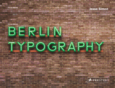
From neoclassical monuments to neon storefronts, Berlin is filled with beautiful typography. Over the past few years, the Berlin Typography project has been photographing the city's best examples of typography, both to celebrate the diversity of letterforms and to preserve its typographic heritage before the old signs of this rapidly changing city are removed and replaced. This book collects the best of these images and shows how walking through Berlin can be like a stroll through a living art gallery--if you're willing to look. Complete with over 200 full-color illustrations, this book showcases the typographic richness of Berlin, including its elaborate, ostentatious shopfront signs, the non-commercial typography of public buildings such as libraries and universities, and the fantastic array of type styles used on street signs and in the city's public transport system. The book also includes an introduction to the history of typography in Berlin as well as a look to its future. The book's captions locate each image within the city. Perfect for graphic designers or lovers of Berlin, this mesmerizing book effortlessly illustrates the role typography plays in our experience of the city.
JESSE SIMON is a writer, editor, designer, and lecturer based in Berlin. As the director of the Berlin Typography project he has devoted several years to documenting the typography of the city.
ERIC JAROSINSKI is a writer, lecturer, and German Studies scholar based in New York. He is best known as editor of @NeinQuarterly, a "Compendium of Utopian Negation" found on Twitter.
Explore the visually arresting typefaces that give Berlin its unique character.
From neoclassical monuments to neon storefronts, Berlin is filled with beautiful typography. Over the past few years, the Berlin Typography project has been photographing the city's best examples of typography, both to celebrate the diversity of letterforms and to preserve its typographic heritage before the old signs of this rapidly changing city are removed and replaced. This book collects the best of these images and shows how walking through Berlin can be like a stroll through a living art gallery--if you're willing to look. Complete with over 200 full-color illustrations, this book showcases the typographic richness of Berlin, including its elaborate, ostentatious shopfront signs, the non-commercial typography of public buildings such as libraries and universities, and the fantastic array of type styles used on street signs and in the city's public transport system. The book also includes an introduction to the history of typography in Berlin as well as a look to its future. The book's captions locate each image within the city. Perfect for graphic designers or lovers of Berlin, this mesmerizing book effortlessly illustrates the role typography plays in our experience of the city.
Author
JESSE SIMON is a writer, editor, designer, and lecturer based in Berlin. As the director of the Berlin Typography project he has devoted several years to documenting the typography of the city.
ERIC JAROSINSKI is a writer, lecturer, and German Studies scholar based in New York. He is best known as editor of @NeinQuarterly, a "Compendium of Utopian Negation" found on Twitter.