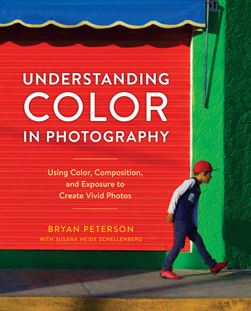
Veteran photographer and instructor Bryan Peterson is best known for his arresting imagery using bold, graphic color and composition. Here he explores his signature use of color in photography for the first time, showing readers his process for creating striking images that pop off the page. He addresses how to shoot in any type of light, and looks at color families and how they can work together to make compelling images in commercial and art photography. He also helps readers understand exposure, flash, and other stumbling blocks that beginning and experienced photographers encounter when capturing images, showing how to get the most out of any composition. With its down-to-earth voice and casual teaching style, Understanding Color in Photography is a workshop in a book, helping any photographer take their images to the next level.
Veteran photographer and instructor Bryan Peterson is best known for his arresting imagery using bold, graphic color and composition. Here he explores his signature use of color in photography for the first time, showing readers his process for creating striking images that pop off the page. He addresses how to shoot in any type of light, and looks at color families and how they can work together to make compelling images in commercial and art photography. He also helps readers understand exposure, flash, and other stumbling blocks that beginning and experienced photographers encounter when capturing images, showing how to get the most out of any composition. With its down-to-earth voice and casual teaching style, Understanding Color in Photography is a workshop in a book, helping any photographer take their images to the next level.

/