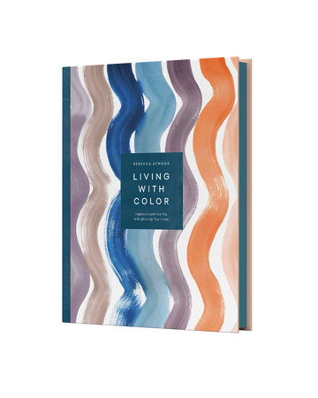
Close Modal

Living with Color

Inspiration and How-Tos to Brighten Up Your Home

Look inside
Hardcover (Paper-over-Board, no jacket)
$35.00 US
8.3"W x 10.3"H x 1.01"D   | 41 oz | 10 per carton
On sale Aug 27, 2019 | 272 Pages | 978-1-5247-6345-9
Discover inspiration from the most colorful homes in America with this vibrant lookbook and style manual that brings the magic of color into your home—from the author of Living with Pattern
 
Personalizing your color palette may be one of the most important decisions you make in your home. The right combination of hues can set the mood and transform any room from ordinary to magical. Textile designer Rebecca Atwood invites you to take a color journey in this stunning yet practical guide. 
 
In Living with Color, you’ll tour beautifully designed homes to see some of the most interesting uses of the rainbow and to gather inspiration for your own spaces. You’ll train your eye to notice how color lives all around you, from the pink light bouncing off a building you see every day to the exact blue of the ocean on your last getaway. You can even learn how to express yourself through your own custom palette with Rebecca’s accessible, illustrated overview of color theory. As you embark on your color hunt and begin to trust your own instincts, Living with Color will embolden you to breathe life into every part of your home.
“More than just a style guide, Atwood’s book takes the conversation around color in refreshingly unexpected directions.”—Business of Home

“Atwood teaches readers how to break their relationship with beige and create a color palette that not only resonates with their aesthetic, but also makes them happy.”Martha Stewart online

“Atwood pulls back the curtain on the profession in the best of ways, showing readers how to find beauty in the simple craftsmanship of the ordinary, and how to channel those findings into proper interiors.”Architectural Digest

“Atwood shows how to notice color in the world, and to be inspired by it.”Publishers Weekly
© Tony Williams
REBECCA ATWOOD received her BFA in painting from the Rhode Island School of Design before beginning her career designing and consulting for major retailers. Today, she is a textile designer, an artist who blends traditional techniques with hand painting, and the author of Living with Pattern. Her interest in pattern is deeply rooted in her childhood on Cape Cod and her everyday observations of life in Brooklyn, where she lives with her husband. View titles by Rebecca Atwood
Introduction

My Color Story

I’ve always been drawn to color, and my parents encouraged my love of art at an early age. At just five years old, I had books on Monet and Renoir, and my earliest memories are of drawing with my two sisters. We would lie on the floor and color for hours, with the sunlight streaming in through the big glass door and our crayons, pencils, watercolors, and giant pieces of paper splayed out around us. At some point, our grandfather gave us a professional set of Pentel markers, and they seemed like a rainbow in a box compared to the simple primary colors we’d used up until then. Housed in a golden case, they were a beautiful object unto themselves, and the most fascinating thing about this rainbow was the multiple versions of the same colors—warm blue and cool blue, a true red and a burgundy. The marker set expanded my color palette, and with all these tools at my fingertips, I became hooked.

As I got older, my color story expanded. Growing up on Cape Cod, I was drawn to the beach in the off-season: the quieter time of year when the individual softer, muted tones of the natural landscape are highlighted because of the limited color palette. This is where I learned to see the beauty of neutrals—not your typical desaturated gray or tan but rather multicolored, chromatic neutrals, which I will teach you all about in this book. 

Artists have long been drawn to the Cape because of its serenity, juxtaposed with dramatic light. In the course of one day, the sand shifts from a soft, pale caramel to a bright cream at midday and, finally, to an ethereal glowing pink before the sun sets. There are infinite hues within these colors of sand, and within all of nature—the sky, the sea, a field, or trees in the distance. There is always tonal variation, with the light picking up and highlighting the different textures in the landscape. I would sit on the beach, looking for these transformations and watching the waves coming in and going out, studying how the sky and water met at the horizon. I realized that this calm but colorful world was where I wanted to live.

Over time, my childhood predilection for drawing gave way to painting and making things with my hands. Painting became my greatest form of expression, and it’s how I learned to understand color. I now recognize that I was attempting to mirror the beauty I saw in nature and the world around me. In middle school, I took a watercolor course where, in preparation for the class, we were given a shopping list of the “basic” colors we would need. We had a warm red and a cool red, as well as neutral hues like ochre and burnt sienna. I remember thinking, “Who would want these bland, boring hues when there’s blue and yellow?” But through this class, and subsequent art lessons, I realized that these earth pigments are primers for creating a world that mimics nature and are building blocks for mixing hues. I was taught that when you’re painting a landscape or a still life, you’re re-creating how the light looks at a particular moment in time, and it subsequently shaped the way I think about color, art, and design.

I was so enamored with these concepts that studying fine art in college seemed like the natural next step, so after high school, I enrolled in Rhode Island School of Design as a painting major. I remember thinking that perhaps I should study something more “practical,” like business, but I had faith that I would be able to bring art into everyday life. Over time I’ve realized that designing rooms and home goods was just like painting landscapes. With a room, you’re making something out of nothing; you have to figure out which colors to use to achieve the feeling you want, and, just as in painting, neutrals are your base from which to build.

I graduated from RISD and began designing products for different companies, but with time I yearned to create art pieces for the home that felt like the landscapes from my childhood and that made it easy to layer livable color. I wanted to make palettes that captured the subdued tones of the Cape and to allow customers to bring the beauty of nature into their homes. I believed the product should feel personal, and I liked the idea of controlling how it was being made. I spent a lot of time thinking about my personal story, collecting inspiration and focusing on the creative process, dreaming up pieces that felt different from anything I’d seen. Instead of producing pieces in response to trends, I wanted to create home goods that could be paired together to make beautiful environments unto themselves. I studied color and never stopped being a student of nature and art, and I want to share all that I’ve learned with you in this book.

About This Book

I begin Living with Color with the concept that color is alive. In Part One: Understanding Color, I’ll introduce you to the world of color through a scientific lens because, before you can decide which paint color is right for your bedroom, it’s important to know that color is about perception. It is constantly changing, and we all experience it differently. This is why colors are so open to interpretation and deeply associated with feelings. Part One also explains how colors interact with one another and why certain colors make us feel cool and others warm. In this section, we’ll consider what feelings you want to perceive in different rooms of your home. There is fascinating science behind why a room makes you feel cozy or calm.

Once you understand that color isn’t static, you open up to the idea that there are infinite tones of colors that change with the season and time of day. In Part Two: Feeling Color, we’ll explore these connections as well as the relationships between color and the senses. Color is so visceral—you can almost taste, touch, and smell it—and here I’ll allow space for your mind to wander, for your mouth to water, and for you to draw free associations with the color world. 

In Part Three: Seeing Color, I’ll share my personal color memories with you and invite you to wash yourself in each color of the rainbow, soak in its rich history, and use it in a palette with other colors. We’ll end this part with tips for how to incorporate each color into your home in thoughtful, organic ways.

In Part Four: Living Color, we’ll tour! I’ll take you inside the homes and lives of those who are living with color and using it in breathtaking ways. From chromatic neutrals to bright bursts, we’ll see color stories in action, alive in the homes of artists and friends.

Lastly, we’ll connect with color on a personal level. Color and meaning are complicated but also inspiring and captivating. In Part Five: Finding Color, I’ll ask you to create your own distinct color wheel using your knowledge, personal exploration, and inspiration to design a rainbow that tells your unique color story. In the final pages of the book, we’ll explore the kind of landscape in which you want to live. We’ll dive into your own color memories and swim around in your color world. We’ll go on a color hunt, looking for magic in the mundane, and open our eyes to the infinite color that surrounds us each day in exciting ways. Noticing the beauty in the myriad greens in your neighbor’s front lawn or the variations in the grays on the sidewalk will make you feel more engaged in life and appreciative on your morning commute.

About

Discover inspiration from the most colorful homes in America with this vibrant lookbook and style manual that brings the magic of color into your home—from the author of Living with Pattern
 
Personalizing your color palette may be one of the most important decisions you make in your home. The right combination of hues can set the mood and transform any room from ordinary to magical. Textile designer Rebecca Atwood invites you to take a color journey in this stunning yet practical guide. 
 
In Living with Color, you’ll tour beautifully designed homes to see some of the most interesting uses of the rainbow and to gather inspiration for your own spaces. You’ll train your eye to notice how color lives all around you, from the pink light bouncing off a building you see every day to the exact blue of the ocean on your last getaway. You can even learn how to express yourself through your own custom palette with Rebecca’s accessible, illustrated overview of color theory. As you embark on your color hunt and begin to trust your own instincts, Living with Color will embolden you to breathe life into every part of your home.

Praise

“More than just a style guide, Atwood’s book takes the conversation around color in refreshingly unexpected directions.”—Business of Home

“Atwood teaches readers how to break their relationship with beige and create a color palette that not only resonates with their aesthetic, but also makes them happy.”Martha Stewart online

“Atwood pulls back the curtain on the profession in the best of ways, showing readers how to find beauty in the simple craftsmanship of the ordinary, and how to channel those findings into proper interiors.”Architectural Digest

“Atwood shows how to notice color in the world, and to be inspired by it.”Publishers Weekly

Author

© Tony Williams
REBECCA ATWOOD received her BFA in painting from the Rhode Island School of Design before beginning her career designing and consulting for major retailers. Today, she is a textile designer, an artist who blends traditional techniques with hand painting, and the author of Living with Pattern. Her interest in pattern is deeply rooted in her childhood on Cape Cod and her everyday observations of life in Brooklyn, where she lives with her husband. View titles by Rebecca Atwood

Excerpt

Introduction

My Color Story

I’ve always been drawn to color, and my parents encouraged my love of art at an early age. At just five years old, I had books on Monet and Renoir, and my earliest memories are of drawing with my two sisters. We would lie on the floor and color for hours, with the sunlight streaming in through the big glass door and our crayons, pencils, watercolors, and giant pieces of paper splayed out around us. At some point, our grandfather gave us a professional set of Pentel markers, and they seemed like a rainbow in a box compared to the simple primary colors we’d used up until then. Housed in a golden case, they were a beautiful object unto themselves, and the most fascinating thing about this rainbow was the multiple versions of the same colors—warm blue and cool blue, a true red and a burgundy. The marker set expanded my color palette, and with all these tools at my fingertips, I became hooked.

As I got older, my color story expanded. Growing up on Cape Cod, I was drawn to the beach in the off-season: the quieter time of year when the individual softer, muted tones of the natural landscape are highlighted because of the limited color palette. This is where I learned to see the beauty of neutrals—not your typical desaturated gray or tan but rather multicolored, chromatic neutrals, which I will teach you all about in this book. 

Artists have long been drawn to the Cape because of its serenity, juxtaposed with dramatic light. In the course of one day, the sand shifts from a soft, pale caramel to a bright cream at midday and, finally, to an ethereal glowing pink before the sun sets. There are infinite hues within these colors of sand, and within all of nature—the sky, the sea, a field, or trees in the distance. There is always tonal variation, with the light picking up and highlighting the different textures in the landscape. I would sit on the beach, looking for these transformations and watching the waves coming in and going out, studying how the sky and water met at the horizon. I realized that this calm but colorful world was where I wanted to live.

Over time, my childhood predilection for drawing gave way to painting and making things with my hands. Painting became my greatest form of expression, and it’s how I learned to understand color. I now recognize that I was attempting to mirror the beauty I saw in nature and the world around me. In middle school, I took a watercolor course where, in preparation for the class, we were given a shopping list of the “basic” colors we would need. We had a warm red and a cool red, as well as neutral hues like ochre and burnt sienna. I remember thinking, “Who would want these bland, boring hues when there’s blue and yellow?” But through this class, and subsequent art lessons, I realized that these earth pigments are primers for creating a world that mimics nature and are building blocks for mixing hues. I was taught that when you’re painting a landscape or a still life, you’re re-creating how the light looks at a particular moment in time, and it subsequently shaped the way I think about color, art, and design.

I was so enamored with these concepts that studying fine art in college seemed like the natural next step, so after high school, I enrolled in Rhode Island School of Design as a painting major. I remember thinking that perhaps I should study something more “practical,” like business, but I had faith that I would be able to bring art into everyday life. Over time I’ve realized that designing rooms and home goods was just like painting landscapes. With a room, you’re making something out of nothing; you have to figure out which colors to use to achieve the feeling you want, and, just as in painting, neutrals are your base from which to build.

I graduated from RISD and began designing products for different companies, but with time I yearned to create art pieces for the home that felt like the landscapes from my childhood and that made it easy to layer livable color. I wanted to make palettes that captured the subdued tones of the Cape and to allow customers to bring the beauty of nature into their homes. I believed the product should feel personal, and I liked the idea of controlling how it was being made. I spent a lot of time thinking about my personal story, collecting inspiration and focusing on the creative process, dreaming up pieces that felt different from anything I’d seen. Instead of producing pieces in response to trends, I wanted to create home goods that could be paired together to make beautiful environments unto themselves. I studied color and never stopped being a student of nature and art, and I want to share all that I’ve learned with you in this book.

About This Book

I begin Living with Color with the concept that color is alive. In Part One: Understanding Color, I’ll introduce you to the world of color through a scientific lens because, before you can decide which paint color is right for your bedroom, it’s important to know that color is about perception. It is constantly changing, and we all experience it differently. This is why colors are so open to interpretation and deeply associated with feelings. Part One also explains how colors interact with one another and why certain colors make us feel cool and others warm. In this section, we’ll consider what feelings you want to perceive in different rooms of your home. There is fascinating science behind why a room makes you feel cozy or calm.

Once you understand that color isn’t static, you open up to the idea that there are infinite tones of colors that change with the season and time of day. In Part Two: Feeling Color, we’ll explore these connections as well as the relationships between color and the senses. Color is so visceral—you can almost taste, touch, and smell it—and here I’ll allow space for your mind to wander, for your mouth to water, and for you to draw free associations with the color world. 

In Part Three: Seeing Color, I’ll share my personal color memories with you and invite you to wash yourself in each color of the rainbow, soak in its rich history, and use it in a palette with other colors. We’ll end this part with tips for how to incorporate each color into your home in thoughtful, organic ways.

In Part Four: Living Color, we’ll tour! I’ll take you inside the homes and lives of those who are living with color and using it in breathtaking ways. From chromatic neutrals to bright bursts, we’ll see color stories in action, alive in the homes of artists and friends.

Lastly, we’ll connect with color on a personal level. Color and meaning are complicated but also inspiring and captivating. In Part Five: Finding Color, I’ll ask you to create your own distinct color wheel using your knowledge, personal exploration, and inspiration to design a rainbow that tells your unique color story. In the final pages of the book, we’ll explore the kind of landscape in which you want to live. We’ll dive into your own color memories and swim around in your color world. We’ll go on a color hunt, looking for magic in the mundane, and open our eyes to the infinite color that surrounds us each day in exciting ways. Noticing the beauty in the myriad greens in your neighbor’s front lawn or the variations in the grays on the sidewalk will make you feel more engaged in life and appreciative on your morning commute.